Load Data
life_exp_file <- here::here("data", "health_ineq_online_table_9.csv")
life_exp <- read_csv(life_exp_file)
Tidy Data
income_quantiles <- c(
  "1" = "Bottom",
  "2" = "Lower Middle",
  "3" = "Upper Middle",
  "4" = "Top"
)
adjustment_types <- c(raceadj = "Race Adjusted", agg = "Unadjusted")

life_exp_tidy <-
  life_exp %>%
  select(cz:year, contains("le_")) %>%
  gather(key, value, contains("le_")) %>%
  extract(
    col = key,
    into = c("variable", "adjustment", "income_quantile", "sex"),
    regex = "(sd_le|le)_(raceadj|agg)_q(\\d)_(\\w)"
  ) %>%
  mutate(
    adjustment = recode(adjustment, !!!adjustment_types),
    income_quantile = recode(income_quantile, !!!income_quantiles),
    sex = recode(sex, "F" = "Female", "M" = "Male")
  ) %>%
  rename(state = stateabbrv) %>%
  spread(variable, value)
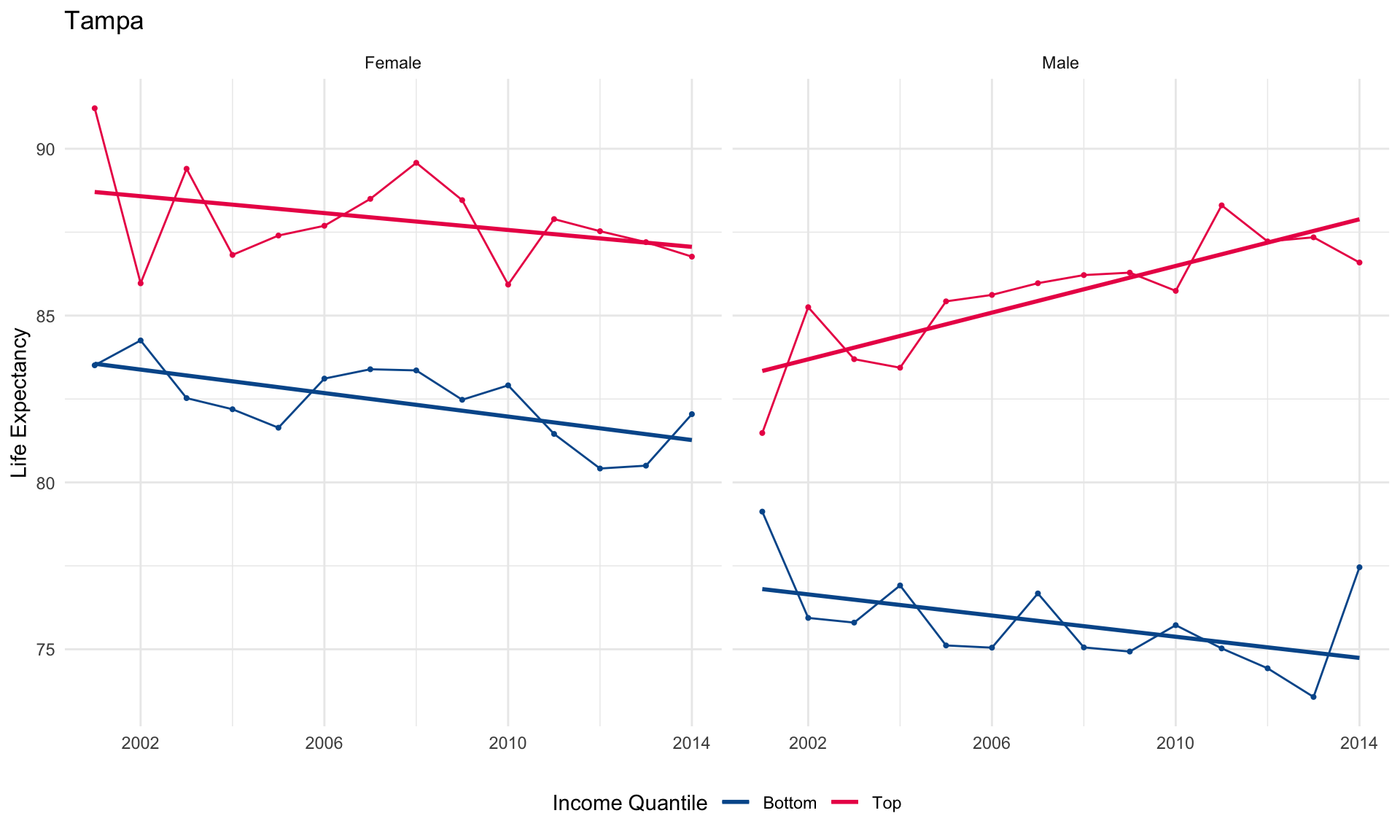
Exploratory Plot: Life Expectancy by Gender and Income Quantile in Tampa
income_quantile_colors <- c(
  "Bottom"       = "#00589a",
  "Lower Middle" = "#82c878",
  "Upper Middle" = "#faa555",
  "Top"          = "#eb1455"
)

life_exp_tidy %>%
  filter(
    czname == "Tampa",
    adjustment == "Race Adjusted",
    income_quantile %in% c("Bottom", "Top")
  ) %>%
  ggplot() +
  aes(
    x = year, y = le,
    color = income_quantile,
    group = paste(income_quantile, sex)
  ) +
  geom_point(size = 0.75, show.legend = FALSE) +
  geom_line() +
  geom_smooth(method = "lm", se = FALSE) +
  facet_wrap(~ sex) +
  scale_color_manual(values = income_quantile_colors) +
  scale_x_continuous(breaks = seq(2002, 2018, 4)) +
  labs(
    title = "Tampa",
    x = NULL,
    y = "Life Expectancy",
    color = "Income Quantile"
  ) +
  theme_minimal() +
  theme(legend.position = "bottom")
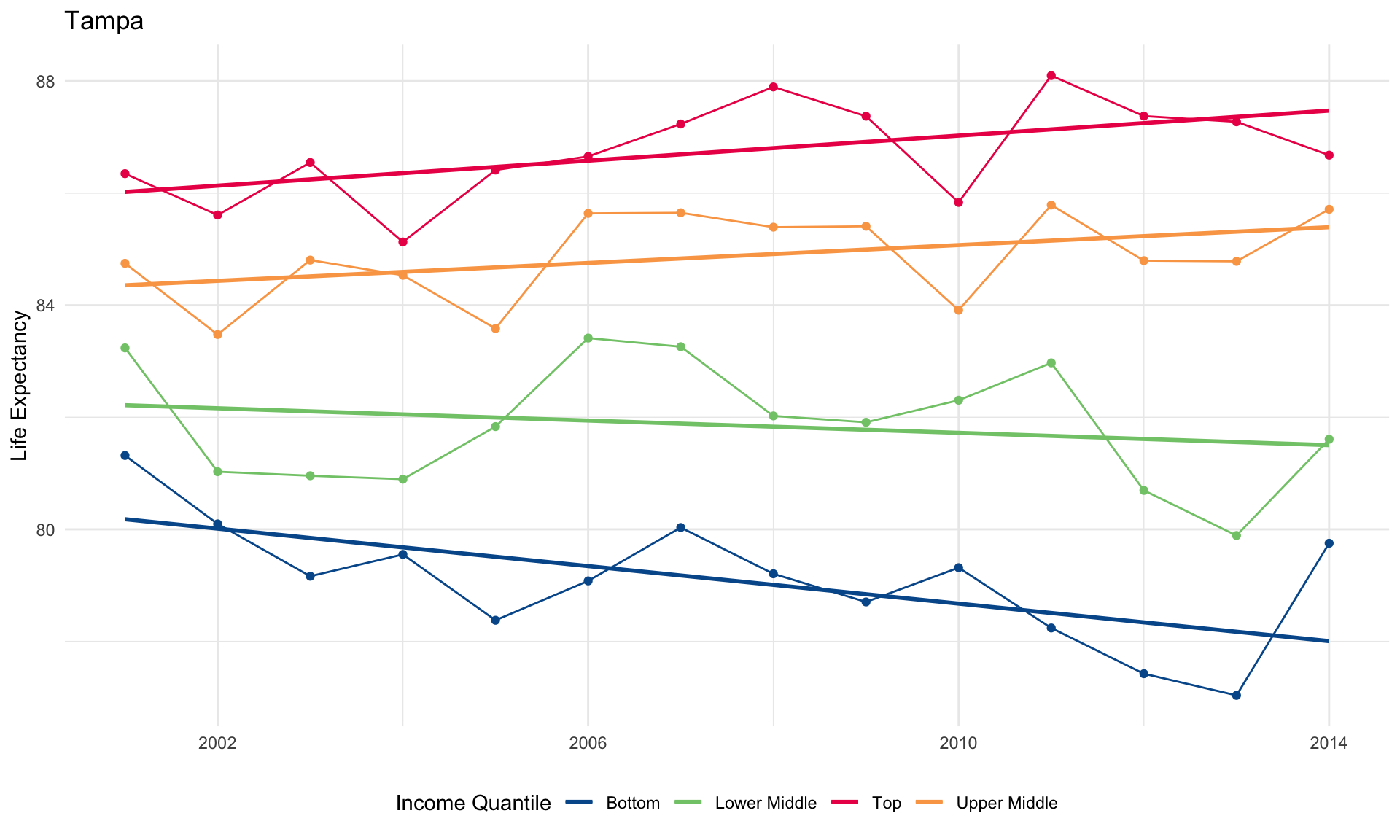
Exploratory Plot: Mean Life Expectancy by Income Quantile in Tampa
life_exp_tidy_mean %>%
  filter(
    czname == "Tampa",
    adjustment == "Race Adjusted"
  ) %>%
  ggplot() +
  aes(x = year, y = le, color = income_quantile) +
  geom_point(show.legend = FALSE) +
  geom_line() +
  geom_smooth(method = "lm", se = FALSE) +
  scale_x_continuous(breaks = seq(2002, 2018, 4)) +
  theme_minimal() +
  labs(
    title = "Tampa",
    x = NULL,
    y = "Life Expectancy",
    color = "Income Quantile"
  ) +
  scale_color_manual(values = income_quantile_colors) +
  theme(legend.position = "bottom")
Model: Life Expectancy by Income Quantile
life_exp_model <-
  life_exp_tidy_mean %>%
  select(czname, state, pop2000, year, adjustment, income_quantile, le) %>%
  filter(
    adjustment == "Race Adjusted",
    income_quantile %in% c("Bottom", "Top")
  ) %>%
  nest(year, le) %>%
  mutate(
    lm = map(data, ~ lm(le ~ year, data = .x)),
    pred = map2(data, lm, modelr::add_predictions),
    est = map(lm, broom::tidy)
  )

head(life_exp_model)
## # A tibble: 6 x 9
##   czname  state pop2000 adjustment  income_quantile data  lm    pred  est
##   <chr>   <chr>   <dbl> <chr>       <chr>           <lis> <lis> <lis> <lis>
## 1 Knoxvi… TN     727600 Race Adjus… Bottom          <tib… <lm>  <tib… <tib…
## 2 Greens… NC    1055133 Race Adjus… Bottom          <tib… <lm>  <tib… <tib…
## 3 Charlo… NC    1423942 Race Adjus… Bottom          <tib… <lm>  <tib… <tib…
## 4 Fayett… NC     644101 Race Adjus… Bottom          <tib… <lm>  <tib… <tib…
## 5 Raleigh NC    1412127 Race Adjus… Bottom          <tib… <lm>  <tib… <tib…
## 6 Virgin… VA    1119468 Race Adjus… Bottom          <tib… <lm>  <tib… <tib…
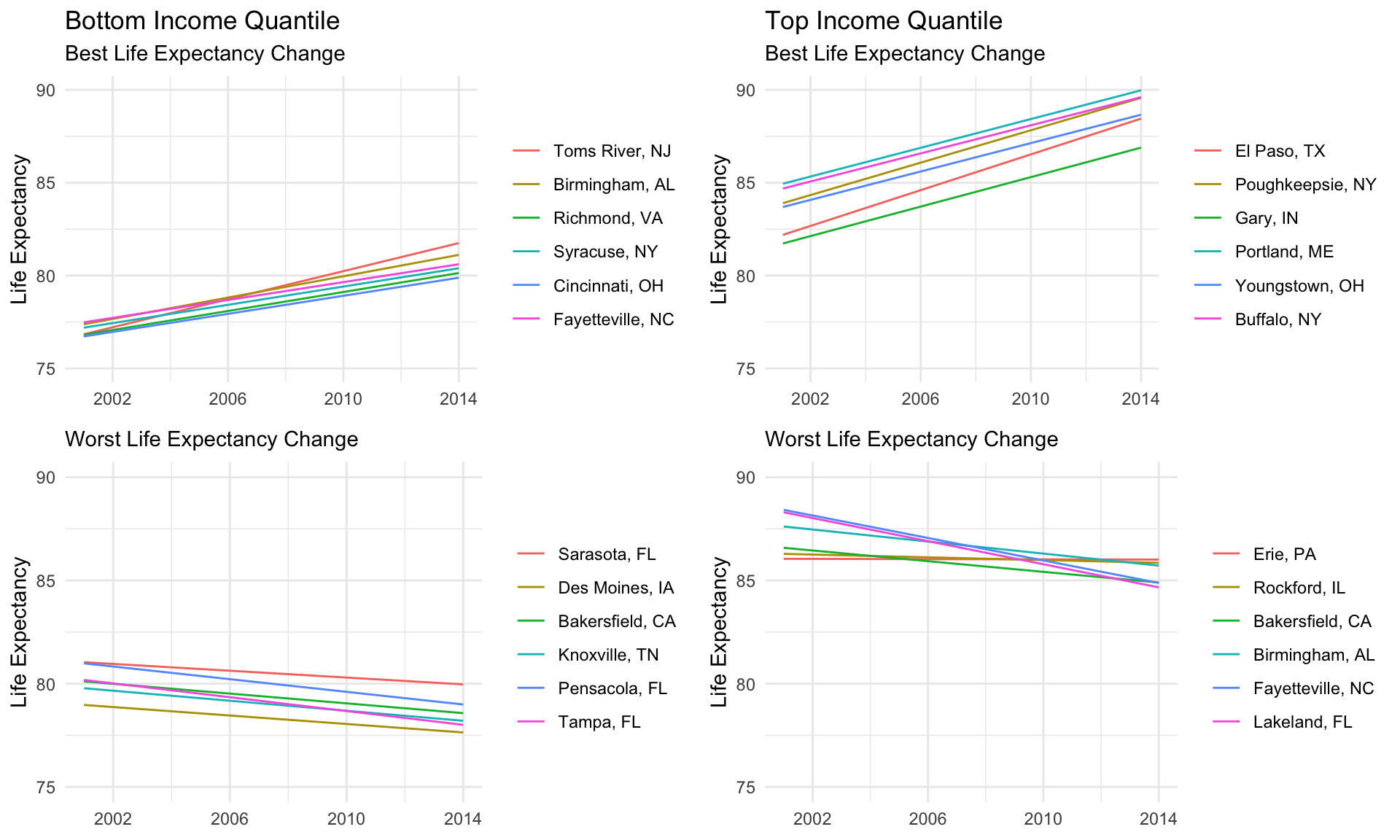
Report: Plot Modeled Life Expectancy in Best and Worst Cities
plot_modeled_life_exp <- function(income_quantile, group, data) {
  data %>%
    arrange(rank) %>%
    mutate(
      city = paste(czname, state, sep = ", "),
      city = fct_inorder(city)
    ) %>%
    ggplot() +
    aes(year, pred, color = city) +
    geom_line() +
    scale_y_continuous(limits = c(75, 90)) +
    scale_x_continuous(breaks = seq(2002, 2018, 4)) +
    labs(x = NULL, y = "Life Expectancy", color = NULL) +
    ggtitle(
      if (group == "Best") glue::glue("{income_quantile} Income Quantile"),
      glue::glue("{group} Life Expectancy Change")
    ) +
    theme_minimal()
}

life_exp_model %>%
  mutate(
    coef = map_dbl(est, ~ .x %>% filter(term == "year") %>% pull(estimate))
  ) %>%
  group_by(income_quantile) %>%
  mutate(rank = min_rank(desc(coef))) %>%
  ungroup() %>%
  filter(!between(rank, 7, 94)) %>%
  mutate(group = case_when(rank <= 10 ~ "Best", TRUE ~ "Worst")) %>%
  arrange(rank) %>%
  unnest(pred) %>%
  nest(-income_quantile, -group) %>%
  arrange(group, income_quantile) %>%
  mutate(plot = pmap(., plot_modeled_life_exp)) %>%
  pull(plot) %>%
  cowplot::plot_grid(plotlist = ., ncol = 2)